In chapter 7 of Design A Very Short Introduction, John Heskett talks about design relating to Identities. Heskett defines identity as such, "a deliberate attempt by individuals and organizations, even nations, to create a particular image and meaning intended to shape, even pre-empt, what others perceive and understand." He goes on to talk about the various identities and the people or groups that use them. Starting with individuals Heskett explains how people have a perceived identity of themselves and an identity they want to project towards others. As an example he talks about how advertising plays into this concept by helping people develop an image of themselves they think they should have and thus exploiting those Identities. This is an excellent point as most clothing manufacturers use this idea of lifestyle to sell their products. In our consumer based society the best way to sell people another pair of pants or another shirt is not to talk about the item but to show people the lifestyle they could have wearing the item. The same could be said for alcoholic beverages. In advertisements for these beverages most companies show people the lifestyle they could have consuming a particular companies beverage over another. All of these examples are exploiting the fact that we as individuals have a personal perception of ourselves.
Heskett next discusses identities of countries. The most obvious aspect of this identity is the use of flags to add a sense of identity and pride to a country. There are other examples though of identity not related to a countries standards. One example Heskett uses is the story of when the United Kingdom replaced the iconic red telephone booths that were part of the British landscape since 1936. British people were outraged because the red booths were part of that countries identity. Another example could be the design of the clothing worn by athletes in the Olympics. Countries try to distinguish themselves by creating a unique identity in the uniforms. This helps the athletes feel part of a team and gives them pride to want to do their best.
But the biggest example of identity, one could argue, is corporate identity. Heskett explains that when companies started off small there was no need for an identity but, as companies grew and expanded to new markets and locations the need arose to have an identifier that employees and customers could relate to. Examples of this can be seen everywhere we look today. Companies spend millions of dollars on the design of corporate identities so people will, one, have an easy way to identify the company, two, give a perception of the company and three make it easily recognizable. Heskett makes a good point when he discusses the difference between identity and image. Heskett uses FedEx and their logo redesign as an example and says the logo is the identity but the image the company wants to convey is one of speedy reliable service. If the company can't provide this then the identity is, in a way, useless.
This chapter really helped me see the importance of design to identity but also taught me that a good identity must be backed up with reliable service and dependability. If it is not then it's just a good design.
Chapter 8 talks about systems. When discussing design we all can see the tangible things, advertisements, products and spaces to name a few. But another form of design can be found in the design of systems. This aspect of design is becoming more popular with the introduction of information systems. Heskett's point on the spread of technical infrastructure systems and the electric supply in California in 2000 is an interesting one. The Idea that these systems are not, typically designed with future use in mind is amazing to me and a good example of how we should apply design thinking to future infrastructure and power system designs. Take the roadways of Columbus for example, more specifically the old I-70/I-71 split. When first designed the roadway could handle the traffic load but as time went on and more and more people were commuting to work from the suburbs the roadway started to become congested to the point of being ineffective. Future design of these systems should take into consideration growth.
Another point along those same lines was in dealing with public transportation systems and how to navigate them. This part was interesting to me because I ride the bus. The system used by Central Ohio Transit Authority (COTA) to help navigate the bus lines, I feel, is not a good system. With maps that are confusing and schedules that don't make much sense, at first glance, it is easy to see why people may be uncomfortable using public transportation in Columbus. As a way to rethink the design, COTA should keep in mind the design should be easily understandable to everyone to the point of being intuitive.
Cradle to Cradle - Introduction
In the introduction of Cradle to Cradle William McDonough paints an all too real and very scary picture of a typical family sitting around their house enjoying activities of several kinds. This family may consider themselves to be environmentally conscious but as McDonough explains may be surrounded by very toxic materials that can be damaging to the environment and to their health as well. This introduction is a great way to grab our attention and prepare us for the subjects ahead. The ideas and problems McDonough discusses in the introduction are mind blowing, for instance how a chromium factory in Europe only employs people over 50 years of age because the chemicals the plant uses take up to 20 years to cause cancer and the workers would be retired by then.
Both William McDonough and co author Michael BraungartMcDonough is an architect while Braungart is a chemist. Both have strong feelings toward the environment, McDonough grew up in Japan and their environmentally minded culture and Braungart was a member of the Green Party in Germany.
I think this book will be interesting as the whole subject of the environment and being environmentally conscious is becoming more important. I look forward to reading the ideas of McDonough and Braungart and learning more about solutions to environmental problems.
Saturday, April 30, 2011
Friday, April 29, 2011
J05 Peer Dialogue 2
I spent the afternoon reading through many of the blogs from class, something I really haven't done yet. The last time I pretty much stuck to the Kings club which I'm sure I will do for this assignment as well. I am glad I took the time to look over some of these blogs because I'm finding some interesting stuff about my classmates.
The first blog I wanted to mention was Zack_S' blog. I love the idea of giving your postings different song titles. Reading all these blogs can be sort of monotonous. Not because there is nothing interesting in them but because we are all blogging about the same things. I think adding the song titles not only makes Zack's blog unique but also breaks up some of the monotony. One suggestion may be, don't tell us the artist and maybe we can guess in our peer dialogue posts. If you haven't read his blog and you do read mine you should check it out:
http://dsgn200spof2011.blogspot.com/
The next blog I found was Shannon Catron's. First of all it's called Chewbacca's Corner which is, quite possibly the BEST title for a blog ever! Second, Shannon is looking to major in Visual Communications which is my major. Right there are two reasons to like this blog, a potential VC major who is a star wars fan. But the thing that really sold me was the Fresh Prince-esq introduction. Again if you haven't seen this blog check it out, good stuff.
http://getzeegroveon.blogspot.com/2011/04/ay-getting-to-know-shamwow.html
Oh and one more thing... really cool found face
On to the Kings!
I like Sarah Howard's course reflection post, especially her interest of the impact of design on the environment. She said, "If as a whole society we focused more energy and efforts innovating and problem solving issues of serious importance than designing pointless items that don’t really do much but look nice I wonder how much different life would be." I like this point because I think this has been the overall theme of the class, using design thinking to change the way we do things for the better and not repeating the mistakes of the past. She ends this post with another really good observation, "Most importantly it will take the efforts of the masses and successful intervention and innovation will require the participation of all."
In Ricardo's first peer dialogue he says, "I like to travel and I think we all should travel to different places and just broaden ourselves and be open to different cultures." I love this point and am glad he said it. I too think everyone should broaden their view of the world. When speaking to one of the design professors on campus I asked him what a person should do to help develop their skills as a designer, to which he replied, "learn a new language, go to that country and see how they do it differently than we do." This conversation has always stuck with me. If we truly want to expand ourselves we need to experience, first hand, how other cultures live, act, work etc.
In Mike Freeze's blog he talks about the lecture on the design process and says of it, "I was a little surprised by the way it was described because I always imagined it to be a much more fluid and free process. But I then discovered that – like many things – the process is unique to each person, company, etc." I too was surprised by the process IDEO uses to develop a design solution. It seemed to me like organized chaos. It's almost as if IDEO throws everything they know about a product or system into the mix and what they do is filter out the most important aspects of it.
Finally some of my favorite found faces:
https://blogger.googleusercontent.com/img/b/R29vZ2xl/AVvXsEjChsjGGGx0ayiAX6Ykj2xslQwaKQBKL6u7ZLOZjfF6C2VgVWn0AUIQ19-wRoXcS7WoGvcfY6-V1B4DnHQIy5Y449b4GaBeVtfdZ17shQWnwZmzPzf7FZSxoKaUarV9qQRgYN_YeKNWrfI/s1600/mms_picture+%25287%2529.jpg - like this one because I too own a mazda 3.
https://blogger.googleusercontent.com/img/b/R29vZ2xl/AVvXsEhsxBNQ0BSLRBlC0ekOcaLroNn6tzMOxTyXCS3ytRGRbXW65u1pZ8Ee3JILKAlh-WQLyU2dTg-w5AV8dQ6lBScNaV6Adwi4Ha9-1oXY6Ho7o7toxIggO7uoKsfA0ieSe4Jf1la0UcAyxdQ/s1600/DSC01806.jpg
https://blogger.googleusercontent.com/img/b/R29vZ2xl/AVvXsEgk_FrTRD8RvxrRXGbma4i-UpE899m4i1JVK1XJbV6rY2UGUV2qrqhhslD05hw9-52W9qq9ayWqwCSLCGt9pqWWuvy83h1E0EqgQiyZmpjh8n_AnZ59BValJJtG1uwfJ9W17h1L24crOmbd/s1600/CIMG1889.JPG - this one almost looks like a character from the simpsons.
https://blogger.googleusercontent.com/img/b/R29vZ2xl/AVvXsEjg59ZHmmM0_cMAD3G6ZXnMo7IfWZ1U76QyEw8qn23Qw-ezi0kTxrDz28ruAI2eGr5VNFZVjOr8GRyGsrIHu30qhtggxCwgMstsv1LvdGGMOFoJnFJiVffVoYpnS2lEMSI3dw_KVIqCNg8/s1600/042111095245.jpg
https://blogger.googleusercontent.com/img/b/R29vZ2xl/AVvXsEj1zLzDpUJL1uB_uRlBITXHBeYWR8Do5SR-yOm5b5VNHVOmNYuphYOojCvyi4CHOCGT135a5oSaHnzDAMw6gQfgis3PguMUMQK1VYb8XvG_yPwOJCXTM6F8P4J_-8chQXVKmH_V5cZIxw/s1600/garage+door+opener.jpg
Monday, April 25, 2011
A03 - Hunting down design
For this assignment Mike Freeze, Ricardo Roberson and I researched the questions together. After answering the initial questions we walked around campus and took pictures of the locations and items we needed. I found the project interesting and a good chance to get to know the other members of the kings club.


1. The Barcelona Chair - Mies van der Rohe - 1929
The Barcelona Chair was designed by Ludwig Mies van der Rohe in 1929 for the Barcelona International Exposition. Mies designed the chair for the Spanish Royalty to sit in during the opening ceremonies for the exposition, and based the design on Roman folding chairs.

2. The Eames Rocker - 1948
The Eames Rocker was designed by Charles and Ray Eames. It was molded out of a single piece of fiberglass re-enforced plastic with metal legs and maple rockers. The chair is sold by Herman Miller. The magazine Mike is reading is an Italian Architectural Magazine called Urbanistica.

3. The Wexner Center
The Wexner Center for the arts was designed by Peter Eisenman and opened in 1989. The building was the first ever commercial project by Eisenman. The building's angles are a reflection of the differences in layout of the city streets of Columbus compared to the layout of the streets on campus which are different by 12.25 degrees. Parts of the movie Little Man Tate staring Jodi Foster were filmed at the Wexner Center.


4. The Math Tower
The Math Tower was one of two buildings designed by Philip Johnson and opened in 1993. An interesting aspect of this building is Johnson's use of huge curving arches in the design. But even more interesting is the doorway (pictured above) and the Juxtaposition of the triangular arrow next to the curving arch.
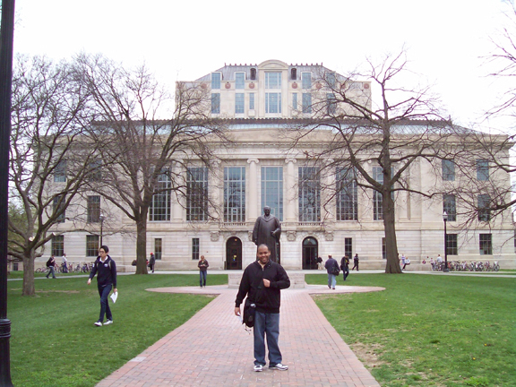
5. The William Oxley Thompson Memorial Library
The Main Library on Campus was renovated in 2006 and reopened in 2009. The renovation of which Acock & Associates worked on, cost $109 million dollars. Upgrades included technical upgrades. According a Columbus Dispatch article dated August 3, 2009 some librarians wanted to do away with the book stack towers but then president Karen Holbrook decided to save them for symbolic value.
CR02 Classes 5-8
Monday April 11th, 2011 - Class 5
In Class 5 we discusses the design process which included methodology and the different types of processes used. The basic overview of the design process can be broken down into five steps: 1. Define the problem, 2. Research the problem, 3. Design cycle, 4. Production, 5. Evaluation.
Define the problem: means to simply state the problem that is in need of a solution. This can include, scope of the project, budget, intended users. The point of this step is to discuss and understand every aspect of the project, this way the designer will not have to make changes down the road for aspects of the job that were not realized.
Research: In this step the designer will research to develop an understanding of the market, codes and legal issues, the client and the user. This step is necessary so the designer knows everything they need to complete the project.
Design cycle: This is the step in the process where the designer will develop concepts and refine them, usually working closely with the client. The Client may offer feedback on the design, tell the designer what they like or dislike or may tell the client to start over. Once the designer and client agree on the design the designer will revise or refine it until they have a final prototype to present to the client.
Production: Once the project enters the production stage the designer will work closely with the manufacturer, printer or builder to make sure what is produced is exactly what the client wants.
Evaluation: Now that the product or space has been produced or built the designer evaluates the design and gets feedback in order to understand if the project was successful. Did the product solve the problem it intended to, are there parts that can be improved or did it create new problems.
The Deep Dive. We finished the lecture with a short film on the company IDEO and their design process. In the film IDEO is given the grueling task of designing a shopping cart that solves the problems of the standard shopping cart, is cheaper to build and friendlier to use by a larger demographic. They are given a 5 day timeline to do this. It was amazing to see the process which IDEO used to, first, identifying the problem and then throwing out different ideas for solutions which IDEO refers to as The Deep Dive. One of the most amazing aspects of the film was how a group as large as the one IDEO had working on the shopping cart project could work together without egos getting in the way. It was a great film to show so the class could better understand the design process.
Wednesday April 13th, 2011 - class 6
In class 6 we discusses designing for accessibility. With more and more people becoming disabled today the idea that everyone no matter the disability should be granted access is becoming more important. The range of disabilities is so great that many new ideas of how to access is also necessary. With visual impairments, audio impairments and mobility issues, designers need to include these people in the discussion when developing a design. This, not only, includes access to buildings but also products and visual designs as well.
The discussion covered ADA which is the Americans with Disabilities Act which states a person should be granted easy access to buildings no matter what the disability. By using ramps to gain entry or door knobs that don't require the dexterity of working hands designers can solve these problems and allow disabled people to enter and use buildings more effectively.
We discusses designing products for universal usage. The concept of Universal Design is to develop products or spaces that can be easily accessed by everyone, no matter the disability.
We finished this lecture with a short film on the development of a smart wheel chair called Hot Wheels. The designer behind the Segway developed an incredible wheel chair which will help the user walk up stairs, or raise to standing height to pick things off of a high shelf. The wheel chair was also designed to be mobile on surfaces standard wheel chairs aren't, like sand and stones. I liked this film because it was a great way to show how design and design thinking can be used to solve problems in our society.
Monday April 18th, 2011 - Class 7
In class 7 we were paired up into our face value groups and sent on a scavenger hunt around campus. My group consisted of Mike Freeze and Ricardo Roberson. We were given five clues which we had to answer and then had to walk around campus and take pictures of the answers to those clues. I liked this assignment because it gave us a chance to work as a team and use problem solving skills but also gave us a chance to get to know the campus as well.
Wednesday April 20th, 2011 - Class 8
We discusses environmental and green design issues in class 8. This was one of my favorite lectures. What I like about this lecture is that it brings us back to the ideas of using design thinking to solve problems and how design is becoming big again. These ideas were briefly touched upon in our first class and I wanted to discuss them further.
By using design thinking we are starting to develop solutions that can benefit people in third world countries. In our country, most of us take for granted our access to health care, clean drinking water and food. In many small countries people are not that lucky but, by utilizing the design process we can develop cheap solutions to help third world countries gain access to the things we take for granted.
We were also introduced to William McDonough one of the authors behind the book Cradle to Cradle which we will be reading in class. His TED talk was amazing especially his ideas of how to rethink the building of cities. His talk coupled with the discussion by Janine Benyus on Biomimicry was a great example of how we can stop wasting our resources and use design to build sustainable products and cities. The Idea in Biomimicry was that animals and insects have been living with their environment and not living in their environment for ages so, we could take examples from nature on how to utilize our resources in a way to live with our environment.
We finished the lecture with two short films highlighting two products developed to solve two important problems in third world countries. Both products were cheap to develop, extremely mobile and solved their specific problem. The first was a water bottle that can filter out even the smallest bacteria to give people clean drinking water where they may not have access to it. The other was a wrap designed to keep premature babies warm so they have the chance to develop, designed for people who may not have access to expensive incubators.
Sunday, April 24, 2011
J04 Found Faces
 |
| 1. My Car. |
 |
| 2. Door Knob. I can almost see it start to talk like a Disney character |
 |
| 3. Space Heater. Happy to keep me warm. |
 |
| 4. Outlet. The first and most obvious face (and most popular in all the blogs) |
 |
| 5. Stapler Strike Plate |
 |
| 6. Antique Stereo and my favorite face |
 |
| 7. The Sad Toilet |
 |
| 8. Tub Faucet. |
 |
| 9. Scary USB face. |
 |
| 10. Ceiling at work. |
Monday, April 18, 2011
J03 Peer Dialogue 01
The Kings Club.
In reading Sarah Howard's blog I really like the messages she got from reading Heskett especially when she said, "I think that the idea of having a business environment and management style designed to delegate tasks and promote discussion in many cases helps achieve more productivity because it can result in increased morale and motivation." This Idea was evident in the film The Deep Dive which we watched in class. By creating a work environment where employees are encouraged to discuss ideas and a leadership style that has a team leader delegate and help the team stay on task, the group can be more productive. On the other hand in a work environment where a faceless boss watches you on camera all day to make sure you are doing your job creates a stresses and non-productive environment.
http://sarahdesign200.tumblr.com/post/4589625537/reading-reflection-ch-1-6-john-heskedesign
I also like Sarah's patterns especially this one:
http://sarahdesign200.tumblr.com/post/4510568849/drain-yet-again-something-that-i-pass-everyday
What a fantastic design. I would really like to know which building this were in front of.
Mike Freeze and I share one interest for sure and that is the design of Apple products. I have always loved the products Apple produces. They are sleek, easy to use and more of a work of art than anything else on the market. One reason I'm so amazed by them is that Apple always seems to get it right. When introducing a product it is Apple that sets the standard for look and feel, then other companies try to copy but never quite design a product to the same level as Apple. A good example is the iPod compared to the Microsoft Zune. I know there are people out there who probably own a Zune and like it but, to me it looks like a bad attempt at trying to get a piece of the MP3 player market. Companies then try to fill these products with features that iPod doesn't have but in doing so clutter the usability of the product.
http://designbyfreeze.blogspot.com/2011/04/designer-investigation-part-03.html
I also am a fan of old movie posters so I was interested in Mike's choice of designer for part 1 Saul Bass. His poster for the film Vertigo is one of my favorites. This blog post got me exploring more of his work.
http://designbyfreeze.blogspot.com/2011/04/designer-investigation-part-01.html
Being a visual communications major I was happy to see Ricardo's interest in graphic design and I think he will get something out of this class. I also love the pattern Ricardo posted, the one of the rocks in particular:
http://rar44331-design200.blogspot.com/2011/04/10-patterns.html
I thought the designers Shaama_H wrote about were wonderful, especially Zaha Hadid
http://shaamasdesign.blogspot.com/2011/04/assignment-02-zaha-hadid.html
Hadid's product designs are so fluid and beautiful, they remind me of liquid metal.
Her architectural work is inspiring especially the JS Bach Chamber Music Hall in Manchester, UK:
http://www.zaha-hadid.com/built-works/js-bach-music-hall
I'm glad Shaama wrote about Hadid so I could be introduced to her work.
I also liked Shaama's journal 01 entry where she talks of designers designing on a small scale, "It was amazing to me how an architect would use his ideas of creativity and grand design in a small thing like chair or a logo for the company rather than design a huge building. However, even designing small things beautifully, as Deskey’s examples have shown, an architect/designer can potentially impact more people’s lives than creating a grand façade in a few places in the world."
http://shaamasdesign.blogspot.com/2011/04/journal-01.html
Sunday, April 17, 2011
A02 Designer Investigation Pt. 3 - Tibor Kalman
When given assignment 2, I tried to select, as a rule, designers I didn't know much about or if I have heard of them, a designer who's work I didn't know much about. I Figured what was the point of the assignment if I could write page after page on someone like Frank Lloyd Wright, a designer I am familiar with. In choosing Tibor Kalman though, I kind of bent that rule. I have heard of Tibor Kalman and have been exposed to several of his works, namely his album designs for the Talking Heads. But I chose him because I wanted to learn more about him. What I discovered, in Tibor Kalman, was a designer who pushed boundaries, made people think and really changed graphic design for the better.
Born in Budapest in 1949 Tibor Kalman and his family moved to the United States just ahead of the Soviet Invasion of Hungary in 1956. His family moved to Poughkeepsie, New York. Kalman attended Journalism school at NYU but dropped out after a year. At that time Kalman worked for a little known bookstore called Barnes and Noble. His first design role was creating window displays for their store. Kalman would eventually become the design director for Barnes and Noble's in-house design department. In 1979 Kalman started his own design firm called M&Co. with Carol Bokuniewicz and Liz Trorato. Clients of M&Co. would include the Limited Corporation and musical group the Talking Heads. M&Co. became famous for throwing out all the rules which pertained to graphic design. Kalman and the designers at M&Co. would go to great lengths to purposely space letters wrong or skew letters just enough in advertisements to make the viewer think something was wrong but they didn't know what. They distorted letter forms and went out of their way to make fonts appear hand drawn. Kalman was not a fan of the polished, straight from design school, off the shelf way of graphic design in the 1980's. The company got the reputation of non-designers, eventually becoming the thorn in the side of the American Institute of Graphic Arts (AIGA). Kalman and M&Co's design philosophy seemed to work as evident in their ever growing client list.
In 1990 Kalman started Colors magazine. A magazine about multiculturalism. Kalman moved to Rome in 1993 to work on the magazine where he had the role of editor-in-chief. The magazine covered controversial subjects such as, racism and the aids epidemic, using striking visuals to inform its readers. The magazine closed and Kalman returned to the United States in 1995 after he developed non-Hodgkins lymphoma. He died in 1999.
One of the most fascinating things about Tibor Kalman was, never having any training in design, he had a natural gift for understanding visual communications. Some of his most interesting works are uncluttered, usually heavily font driven pieces, which were short and to the point. Perhaps his lack of formal training was the reason his design work was so effective. He didn't realize he was breaking the rules and so was free to experiment until he found what worked. Kalman was quoted as saying when asked about his opinion of graphic design, "It's not brain surgery." I think it was his relaxed attitude toward graphic design which allowed Kalman to strip away all of the excess and concentrate on what was important, the message.
Kalman's work was usually very much to the point, as if he felt no need to tip toe around stubjects. In the following examples notice how much of his work is lacking in decoration but not in meaning.
Kalman and M&Co also designed many quirky products. Below are a couple of examples.
Tibor Kalman's work with colors magazine


Sources
Farrelly, Liz. Tibor Kalman Design and Undesign. Watson-Guptill, 1998
http://en.wikipedia.org/wiki/Tibor_Kalman
Born in Budapest in 1949 Tibor Kalman and his family moved to the United States just ahead of the Soviet Invasion of Hungary in 1956. His family moved to Poughkeepsie, New York. Kalman attended Journalism school at NYU but dropped out after a year. At that time Kalman worked for a little known bookstore called Barnes and Noble. His first design role was creating window displays for their store. Kalman would eventually become the design director for Barnes and Noble's in-house design department. In 1979 Kalman started his own design firm called M&Co. with Carol Bokuniewicz and Liz Trorato. Clients of M&Co. would include the Limited Corporation and musical group the Talking Heads. M&Co. became famous for throwing out all the rules which pertained to graphic design. Kalman and the designers at M&Co. would go to great lengths to purposely space letters wrong or skew letters just enough in advertisements to make the viewer think something was wrong but they didn't know what. They distorted letter forms and went out of their way to make fonts appear hand drawn. Kalman was not a fan of the polished, straight from design school, off the shelf way of graphic design in the 1980's. The company got the reputation of non-designers, eventually becoming the thorn in the side of the American Institute of Graphic Arts (AIGA). Kalman and M&Co's design philosophy seemed to work as evident in their ever growing client list.
In 1990 Kalman started Colors magazine. A magazine about multiculturalism. Kalman moved to Rome in 1993 to work on the magazine where he had the role of editor-in-chief. The magazine covered controversial subjects such as, racism and the aids epidemic, using striking visuals to inform its readers. The magazine closed and Kalman returned to the United States in 1995 after he developed non-Hodgkins lymphoma. He died in 1999.
One of the most fascinating things about Tibor Kalman was, never having any training in design, he had a natural gift for understanding visual communications. Some of his most interesting works are uncluttered, usually heavily font driven pieces, which were short and to the point. Perhaps his lack of formal training was the reason his design work was so effective. He didn't realize he was breaking the rules and so was free to experiment until he found what worked. Kalman was quoted as saying when asked about his opinion of graphic design, "It's not brain surgery." I think it was his relaxed attitude toward graphic design which allowed Kalman to strip away all of the excess and concentrate on what was important, the message.
Kalman's work was usually very much to the point, as if he felt no need to tip toe around stubjects. In the following examples notice how much of his work is lacking in decoration but not in meaning.
 |
| Poster for the 1988 Presidential election Kalman designed for Florent Restaurant in New York. |
 |
| Advertisement for Florent Restaurant. |
 |
| A spread for for the March 1991 issue of Interview Magazine. |
Kalman and M&Co also designed many quirky products. Below are a couple of examples.
 |
| A clock design, of which, M&Co did many |
 | |
| An umbrella designed by M&Co. |
Tibor Kalman's work with colors magazine


 |
| Colors Magazine covers. These show how Kalman Used Striking images and type to make the message clear. |
Sources
Farrelly, Liz. Tibor Kalman Design and Undesign. Watson-Guptill, 1998
http://en.wikipedia.org/wiki/Tibor_Kalman
Friday, April 15, 2011
A02 Designer Investigation Pt. 2 - Raymond Loewy
I chose Raymond Loewy for several reasons. First because of the tremendous scope of work he has completed in his lifetime. Second I have a weird obsession with all things streamlined which Loewy was one of the first designers to make the style popular. And third even though he is considered an industrial designer, Raymond Loewy has worked in just about every aspect of design, including interior space, graphic and even fashion. On top of all of that, even though they may have been updated, some of Loewy's designs are still in use today, including International Harvester and the Shell logo.
Raymond Loewy was born in Paris in 1893. Loewy received a degree in engineering before joining the French Army and becoming a captain, durring in World War I. In 1919 Loewy came to the United States. He found work as a window designer for Macy's Wanamaker and Saks. He also worked as a fashion illustrator for Harper's Bazaar. His first industrial design job was in 1929 for a company called Gestetner. Loewy worked in the design field for 7 decades until he retired in 1980 at the age of 87.
Raymond Loewy has been called many things, "the father of industrial design," or "the man who shaped America." Loewy's designs were very modern for their time. Some of them still very present in our popular culture, including the Coke bottle. One of the most interesting things I found about Loewy was the incredibly long list of companies Loewy was hired to design for. The following are a few of Lowey's designs and illustrations that I found Most interesting.
Raymond Loewy designed several things for Studebaker between the 1940's and the 1960's, including their logo. Studebaker asked Loewy to design a car for the company which would appeal to a younger demographic. What was produced was called the Avanti. What drew me to this design first was I know someone who owns one but, never knew the signifigance behind it or its famous designer until I started researching Loewy. The Avanti had a very sporty swept back style and became instantly popular upon it's release in 1963. Another reason I was drawn to this design was the car looked way ahead of its time, if compared to cars of the early 1960's.
The Pennsylvania Railroad S1 steam locomotive is one of Loewy's most famous designs and the reason Loewy is considered one of the founders of the streamline style. Built in 1938 the engine was a very experimental design. When I first saw this image I was reminded of a rocket ship, which got me thinking if this could have been the influence behind the rocket ships in 1940's Flash Gordon comics.

Raymond Loewy was born in Paris in 1893. Loewy received a degree in engineering before joining the French Army and becoming a captain, durring in World War I. In 1919 Loewy came to the United States. He found work as a window designer for Macy's Wanamaker and Saks. He also worked as a fashion illustrator for Harper's Bazaar. His first industrial design job was in 1929 for a company called Gestetner. Loewy worked in the design field for 7 decades until he retired in 1980 at the age of 87.
Raymond Loewy has been called many things, "the father of industrial design," or "the man who shaped America." Loewy's designs were very modern for their time. Some of them still very present in our popular culture, including the Coke bottle. One of the most interesting things I found about Loewy was the incredibly long list of companies Loewy was hired to design for. The following are a few of Lowey's designs and illustrations that I found Most interesting.
 |
| Production sketch for the 1963 Avanti |
 | ||||
| 1938 S1 Steam Locomotive |
 |
| See America in style |
The 1951 Greyhound Scenicruiser, is another very famous Loewy design. What I like most about the Scenicruiser is how Iconic this bus is. Another aspect of the design I found interesting was how I associate this bus with Greyhound. Loewy built the bus for GM but, even without the Greyhound logo on the side the bus still says Greyhound to me.

Over the years Raymond Loewy has designed many identities and logos for various companies. The image to the right is an example of how many company logos he designed and how many are still used today. From the famous "guy on tractor" logo of International Harvester to the completely iconic shell logo Loewy had a gift for creating very recognizable identities for companies all over the world. What I like about this picture is the limited color pallet which Loewy used in his logo designs. Another thing is how simple most of the logos are. Loewy didn't over think the logo. As a visual communications major these and some of Loewy's other logos really interest me.
There are many other designs Raymond Loewy was famous for. While reading about Loewy's life and career I started to get the sense that he never stopped designing. He seemed to always find a way to improve on a design and at the same time be very innovative. For a man who didn't retire until the age of 87 and had a career that lasted almost 70 years one gets the sense that design was truly Raymond Loewy's passion. Loewy is truly inspiring.
Sources:
http://www.raymondloewy.org © 2006 Loewy Design
http://en.wikipedia.org/wiki/Raymond_Loewy
Wednesday, April 13, 2011
A02 Designer Investigation pt. 1 - Adolf Loos
I didn't discover Aldolf Loos. I was more, pointed in his direction, but I'm glad I was introduced to his work. Immediately I knew I would appreciate his work and philosophy. I am a really big fan of Frank Lloyd Wright. What I discovered in Loos are many of the same qualities as Lloyd Wright. I also noticed some of the same ideas and similar styles. It didn't surprise me then to find out Loos appreciated the work of Louis Sullivan, the Architect with whom Lloyd Wright apprenticed. Adolf Loos was also a staunch critic of excessive ornamentation and published a paper titled Ornament and Crime which was an attack on the popular styles of the Vienna Secession.
Born in Bruenn, Moravia in 1870 Adolf Loos was the son of a stone mason. Loos studied at technical school in Liberec, Czech Republic and in Dresden. In 1893 he came to the United States to visit the Colombian Exposition in Chicago. It was here that he was first introduced to the work and writing of Louis Sullivan. After leaving the United States Adolf Loos moved to Vienna and found work as an interior designer.
In 1908 he published Ornament and Crime. In the essay Loos explained his dislike of excessive ornamentation and felt it was a crime to have builders waste their time on the ornamentation that will quickly become obsolete.
When looking at Adolf Loos' work there are several designs that I really like:
http://www.galinsky.com/buildings/americanbar/index.html
The Karntner Bar or American Bar in Vienna. I can really see similarities in this building with the building of Frank Lloyd Wright. Notice the clean unadorned lines and then compare it to
Frank Lloyd Wright:
http://www.wright-house.com/frank-lloyd-wright/
Another one of Adolf Loos Projects I liked is called the Villa Mueller:
http://www.galinsky.com/buildings/villamueller/index.htm
This house drew me in because of the clean exterior and reminded me of the works of Richard Meier
http://en.wikipedia.org/wiki/Richard_Meier
You can see the influence Adolf Loos has had in Meier and other modern architect's work.
Born in Bruenn, Moravia in 1870 Adolf Loos was the son of a stone mason. Loos studied at technical school in Liberec, Czech Republic and in Dresden. In 1893 he came to the United States to visit the Colombian Exposition in Chicago. It was here that he was first introduced to the work and writing of Louis Sullivan. After leaving the United States Adolf Loos moved to Vienna and found work as an interior designer.
In 1908 he published Ornament and Crime. In the essay Loos explained his dislike of excessive ornamentation and felt it was a crime to have builders waste their time on the ornamentation that will quickly become obsolete.
When looking at Adolf Loos' work there are several designs that I really like:
http://www.galinsky.com/buildings/americanbar/index.html
The Karntner Bar or American Bar in Vienna. I can really see similarities in this building with the building of Frank Lloyd Wright. Notice the clean unadorned lines and then compare it to
Frank Lloyd Wright:
http://www.wright-house.com/frank-lloyd-wright/
 |
| Adolf Loos' American Bar |
 |
| Frank Lloyd Wright's Unity Temple |
Another one of Adolf Loos Projects I liked is called the Villa Mueller:
http://www.galinsky.com/buildings/villamueller/index.htm
This house drew me in because of the clean exterior and reminded me of the works of Richard Meier
http://en.wikipedia.org/wiki/Richard_Meier
 |
| Adolf Loos' Villa Mueller |
 |
| Richard Meier's Rachofsky House |
You can see the influence Adolf Loos has had in Meier and other modern architect's work.
RR01 Heskett ch. 1-6
Heskett begins with the question, what is design? He makes the argument that because of the wide range of design professions and terminology associated with these professions, it makes it difficult to define what design is. He goes on to define it as such, "Design is one of the basic characteristics of what it is to be human, and an essential determinant of the quality of human life." "Very few aspects of the material environment are incapable of improvement in some significant way by greater attention being paid to their design."
I underlined this last sentence in the book because I think it defines what design is very well. At its root, I think design is a way to better peoples existence through making what we do, where we live, what we see, each day easier. And Heskett makes the point that there are few things in our lives that we cannot improve on.
He next takes us through a brief history of design where he talks of primitive man and the tools they used. Not only was that the obvious place in history to start the chapter but a great way to further illustrate the point of chapter one. The evolution of tools crated by our ancestors to make work easier is a great example of making our lives easier through design. Heskett continues with touching on moving from hunter gatherers to a more agriculturally based way of living. With each new era comes new problems to solve and new tools required. What I find interesting in this section is this is where skilled trades really emerge. It was these first skilled workers who were, in a way, the first designers.
The beginning of the Industrial Revolution brought about such sweeping changes in the way people bought and sold products. These changes along with the introduction of the middle class brought about a greater demand for products and designs. To illustrate this point Haskett uses the automobile. Once a plaything for the wealthy, Henry Ford's ideas for mass production and Alfred P. Sloan's ideas of adapting that mass production for different markets helped create a great demand for automobiles within the middle class.
One of my favorite chapters, chapter 3 deals with Utility and Significance. I like this argument and how it evolved in the history of design. As more people were buying goods and companies were figuring out new ways to sell these goods we started to see a new trend in design for design sake. Companies hired designers to redesign products without changing the overall function for the purpose of selling more products. There started to develop an overall distaste of useless ornamentation leading designers such as, Louis Sullivan to state that "form ever follow function." The Idea that form follows function was the basis for new movements in design. Walter Gropius started the Bauhaus in 1919 on the idea that we could strip away the useless decoration and design a functioning building or product.
Heskett finishes chapter 3 discussing how, as companies became global, the idea of design thinking started to take shape. Designers had to understand the culture of the people they were selling to as well as their needs. He illustrates this by using the story of Coca-Cola entering the Chinese market where they had to adapt their packaging to be more appealing to the customer.
Heskett spends the next three chapters explaining, in greater depth, the different roles of designers. Chapter 4 deals with objects. Heskett discusses the role of Product Designers. He uses many examples of both good and bad product designs such as the Juicy Salif by Philippe Starck. Although a work of art the Juicy Salif, which is supposed to be a fruit juicer Heskett explains, is almost completely nonfunctional as such. The reason he uses this example is to illustrate the difference between an object designed for its function and one designed for its aesthetic.
Product designers have not only the task of creating usable products but also understanding the environment the user will be working in. In another example Heskett uses the Aeron chair. The designers, Don Chadwick and Bill Stumpf, not only solved the basic problem of the chair, as a means to sit, but took into consideration the environment and ergonomics to build a chair which solves other problems people may face throughout their working day.
Chapter 5 discusses Visual Communication and how people communicate. People depend on visual communication every day through either printed material or television. It is a source for news and information. Heskett explains that we are surrounded by visuals everyday and these visuals are designed to communicate information immediately. It may also be required to communicate without language. One example he uses are the symbols developed for the 1972 Munich Olympic games where Otl Aicher used simple figures to communicate to a wide range of people from different ethnic backgrounds by eliminating language all together.
Visual Communication is also used as a means to sell through advertising and marketing. Heskett says, "the influence of advertising cannot be underestimated, particularly where it has been refined as an instrument of inducing mass consumption." He goes on to use the United States as an example and explains how certain aspects of advertising have become part of our cultural fabric.
Heskett discusses environments in chapter 6 and sums up the subject in the first paragraph where he says, "When considering environments, additional layers of complexity come into play. In common with objects and communications, form, color, pattern, and texture are basic compositional elements, but the articulation of space and light is a specific characteristic of the design of environments." In other words, somethings are up to the designer to choose, color, form and texture but somethings are not and it is these things among others that interior space designers must take into consideration.
Our environments are where we live, work and play. The role of an interior space designer is to determine what the space will be used for and how best to use the space. Heskett discusses the impacts designers have to our experience within these spaces.
Sunday, April 10, 2011
CR01
First class. Monday, March 28, 2011
We spent our first class getting to know everyone. We were given a playing card at the beginning of class then were asked to pair up with the person who had the same face value of the opposite suit. So for instance I had the King of Hearts and was to find the King of Diamonds. Once we found each other we were given a short amount of time to get to know the person then, we had to introduce the person to the class. I thought this was a clever way to get us to interact with each other. I came away from class one knowing .5 is not the lowest dot number in the class and that most of us can't juggle.
Class two. March 30, 2011
Our second class covered a brief history of design. We discussed the difference between fine art and design with fine art being defined as art for oneself where as design is directed toward others. For example, Industrial Designers develop products to help people do things with greater ease.
Primitive tools are a good example of using design as a way to better our lives. Primitive humans realized using tools instead of their own hands made tasks easier more efficient and put less strain on their bodies.
From primitive tools we jumped to the Industrial revolution which is where, I think, design as a profession really evolved.
We covered the steam engine which was developed by James Watt in 1765 and made mass production possible. Out of mass production emerged the middle class which in turn created a need for new products. What I found interesting was the style of products of the era. For the first time people could afford items usually reserved for the upper class. Products reflected the lavish excesses of the wealthy. One example was a toilet intricately designed with the head of a chimera. It makes me wonder if this is what made designers such as Louis Sullivan state that form should follow function and the reason Adolf Loos had negative feelings toward excessive ornamentation.
Another thing I found interesting in our discussion was while talking about Louis Sullivan. After the Great Chicago Fire hundreds of designers and architects came to Chicago to help rebuild. Was it this need to rebuild that helped develop new ideas in building and engineering? If so could the same be said for Europe after World War II? With innovations in industrial design, building design and transportation, was the need to rebuild the reason for this boom in design?
We covered the Bauhaus and Walter Gropius. We found out that OSU's design department is based on the Bauhaus Model that states design students should have a basic understanding in drawing, color and design history before entering the design program.
We also discussed the beginning of corporate culture. Making a company more recognizable and marketable was essential to selling products. Corporate Identity was one way of making a company a household name. Stream lining being an example of redesigning existing products to keep people buying them.
We finished by talking about the evolution of the chair.
Class three. April 4, 2011
We went on a walking tour and visited two of the campus libraries. The first was the fine arts Library inside the Wexner Center, the second was the architectural library. We were also given our next assignment which is a designer investigation. Using the resources at these two libraries, we have to research three designers and write about them in our blog.
Class four. April 6, 2011
In class four we covered the subject of what design is and had an in depth discussion of the three disciplines of design taught at Ohio State. Even though I already knew the three disciplines I found it interesting to learn what each disciple specialized in. I, for instance, didn't know an interior designer was responsible for product displays in retail establishments. That is something I thought a graphic designer would do. I was also interested in the discussion on the differences between architects, interior decorators and interior designers. This is a subject I can relate to as my wife, an interior design major, is regularly referred to as an interior decorator. This discussion clarified the three.
I find industrial design interesting because it takes things into consideration I would never have thought. For instance, designing products so they are intuitive and user friendly. Industrial designers have to assume a user has never picked up a cell phone before.
We finished the class with a short film on Paul Rand. Rand was famous for his corporate logos, which include the logos for UPS, ABC and IBM. One point Rand makes in the film that really stuck with me is when comparing graphic artists to fine artists. He felt that if he made graphic art fine then why shouldn't it be considered fine art as well.
Saturday, April 9, 2011
Found Patterns J02
For journal 2 we were supposed to collect patterns, either man made or natural and post our 10 favorites along with a brief description of each. The following are my 10 favorites.


 |
| 1. Moire Pattern - Wednesday, April 6th - At work I chose this pattern because it is always changing. A Moire Pattern occurs when two competing patterns overlap. The result is an ever changing pattern of shapes. The above images are all the same photo but, shown at different distances. Notice how the pattern changes as the image is zoomed in and out. |
 | ||||||||||||||||||||||||||||||||||||||||||||||||||||||||||||||||||
| 2. Pavement made by man, Pattern made by nature. Wednesday, April 6th What drew me to this pattern was how random the pattern was. Also, as stated in the title, I thought it was ironic that even though this is a man made object the pattern is technically made by nature. Through years of freezing, thawing, heat and pressure this pattern emerged. 
|


Subscribe to:
Posts (Atom)